

Logos are often the first point of contact between a brand and its audience. In a world overflowing with visual stimuli, a logo must communicate identity, values, and personality within seconds. The effectiveness of a logo does not happen by accident; it is the result of deliberate decisions regarding color, typography, and shape. These three elements work together to create visual cues that influence perception, memory, and emotional response. Understanding how they function individually and collectively is essential for building powerful brand recognition.
TLDR: Color, typography, and shape are the three foundational pillars of logo recognition. Color evokes emotion and improves memory recall, typography communicates personality and tone, and shapes trigger subconscious associations. When strategically combined, these elements create strong visual identities that are instantly recognizable. Brands that use them consistently gain higher trust, recall, and customer loyalty.
The Psychology of Color in Logo Recognition
Color is often the most immediately noticeable feature of a logo. Research in visual cognition shows that people form opinions about products and brands within seconds, and a significant portion of that judgment is based on color alone. Colors evoke specific emotions and associations, many of which are rooted in cultural and psychological patterns.
For example:
- Red often communicates energy, passion, urgency, or excitement.
- Blue is associated with trust, security, and professionalism.
- Green suggests growth, health, and environmental consciousness.
- Yellow conveys optimism, warmth, and friendliness.
- Black implies sophistication, luxury, and authority.
These associations influence how consumers perceive a brand before reading a single word. Financial institutions frequently adopt blue to reinforce trust, while food brands may use red or yellow to stimulate appetite and attention.

Beyond emotion, color significantly impacts memory retention. Studies suggest that color can increase brand recognition by up to 80%. This is because the human brain processes color faster than text or shape. When a brand consistently uses a distinctive color palette, audiences begin to associate that palette with the brand identity, even in the absence of its name.
Consistency is key. When brands frequently change colors, they weaken recognition. A stable, well-chosen palette reinforces familiarity, and familiarity builds trust.
The Power of Typography in Brand Identity
While color may capture attention first, typography shapes how a brand “speaks.” Fonts communicate personality and tone just as clearly as words do. Serif fonts, sans-serif fonts, script styles, and custom lettering each carry psychological implications.
Typography can be categorized broadly into several styles:
- Serif fonts: Traditional, reliable, authoritative.
- Sans-serif fonts: Modern, clean, approachable.
- Script fonts: Elegant, personal, creative.
- Display fonts: Bold, unique, expressive.
For instance, a law firm is more likely to choose a serif typeface to communicate stability and professionalism, while a technology startup might opt for a minimalist sans-serif font to suggest innovation and clarity.
Letter spacing, weight, and case also influence perception. Bold, uppercase typography may signal strength and dominance. Thin, lowercase letters can feel friendly and accessible. Even slight modifications, such as rounded edges versus sharp angles, alter emotional interpretation.
Custom typography is particularly powerful for logo recognition. When a font is uniquely crafted or heavily modified, it becomes inseparable from the brand identity. This distinctiveness makes imitation difficult and recognition easier.
Importantly, typography must balance readability with personality. A beautiful font that is difficult to read undermines brand clarity. Effective logos achieve harmony between aesthetic appeal and immediate legibility.
The Influence of Shape and Form
Shapes operate at a subconscious level. Even before color and words are fully processed, the human brain interprets basic forms and assigns meaning to them. Circles, squares, triangles, and organic forms all carry psychological weight.
Common shape associations include:
- Circles: Unity, harmony, community, protection.
- Squares and rectangles: Stability, strength, reliability.
- Triangles: Innovation, power, direction, movement.
- Organic shapes: Creativity, spontaneity, friendliness.
Rounded shapes tend to feel more approachable and inclusive, while sharp angles suggest precision and efficiency. These subtle cues affect whether a brand seems warm and welcoming or authoritative and bold.
Image not found in postmetaSimplicity in shape also improves recognition. The human brain prefers easily digestible visual information. Complex logos with multiple intricate shapes are harder to remember and reproduce mentally. In contrast, clean and scalable forms enable faster identification across various platforms, from business cards to billboards to mobile apps.
Scalability is particularly important in the digital age. A logo must remain recognizable whether displayed as a tiny app icon or a large-format banner. Strong foundational shapes ensure flexibility without losing identity.
How Color, Typography, and Shape Work Together
Individually, color, typography, and shape are powerful. Together, they create synergy. A circular logo in blue with a soft sans-serif font communicates something very different from a red triangular logo with sharp, bold lettering.
Consider the interaction between these elements:
- A blue circular logo reinforces feelings of trust and community.
- A black square logo suggests sophistication and structure.
- A green organic logo with rounded typography conveys environmental friendliness and approachability.
When these elements align with a brand’s mission and audience expectations, recognition accelerates. Inconsistent combinations, however, can create confusion. For example, playful script typography paired with rigid geometric shapes may send mixed signals unless intentionally designed for contrast.
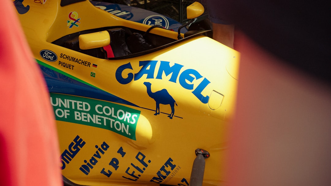
Consistency across platforms strengthens cognitive associations. Each exposure reinforces neural pathways in the brain. Over time, the mere glimpse of a specific color or partial shape can trigger full brand recall. This phenomenon explains how some brands are identifiable even when partially obscured.
The Role of Repetition and Exposure
Even the most strategically designed logo requires repetition to achieve strong recognition. Marketing channels such as websites, social media, packaging, and advertisements serve as repeated visual touchpoints.
When color, typography, and shape remain consistent across all applications:
- Brand recognition increases.
- Consumer trust deepens.
- Perceived professionalism improves.
- Competitive differentiation strengthens.
In contrast, inconsistent branding weakens memory structures. Slight modifications may seem minor internally but can significantly disrupt external recognition.
Cultural and Contextual Considerations
It is important to acknowledge that color and shape meanings vary across cultures. For example, white symbolizes purity in some cultures but mourning in others. Red may signal luck in certain regions while representing danger elsewhere. Brands operating internationally must research cultural symbolism before finalizing design elements.
Industry context also matters. A color that feels innovative in one sector may appear inappropriate in another. Successful logo design carefully analyzes target audience expectations and competitive landscapes.
The Science Behind Visual Memory
Neurological studies show that visual information is processed significantly faster than text. The brain’s visual cortex identifies patterns, contrasts, and shapes in milliseconds. This rapid processing explains why logos can trigger immediate brand recall without verbal reinforcement.
Distinctiveness plays a major role. Unique combinations of color and form stand out against competitors. When a brand owns a particular visual territory, it becomes easier for consumers to categorize and remember it.
Ultimately, effective logo recognition is not just about beauty. It is about strategic alignment between psychological principles and design execution.
Conclusion
Color, typography, and shape are not decorative afterthoughts; they are strategic tools that drive brand recognition and emotional connection. Color captures attention and evokes feeling. Typography conveys voice and personality. Shape activates subconscious associations and ensures structural clarity. When combined thoughtfully and used consistently, these elements create powerful visual identities that endure over time.
Brands that understand these principles do more than design attractive logos. They build symbols that audiences trust, remember, and recognize instantly.
Frequently Asked Questions (FAQ)
- Why is color so important in logo design?
Color influences emotional response and memory recall. It helps consumers quickly categorize and remember a brand, often before reading any text. - Does typography really affect brand perception?
Yes. Typography communicates personality and tone. Serif fonts may suggest tradition and authority, while sans-serif fonts often convey modernity and simplicity. - Are simple logos more effective than complex ones?
In most cases, yes. Simple logos are easier to recognize, remember, and scale across different sizes and platforms. - How do shapes influence consumer trust?
Shapes trigger subconscious associations. For example, circles often suggest unity and safety, while squares convey stability and reliability. - Can a logo succeed without bright colors?
Absolutely. Neutral or monochromatic logos can be highly effective if typography and shape are distinctive and strategically aligned. - How long does it take for a logo to become recognizable?
Recognition develops through repeated exposure and consistent branding. Strong design accelerates the process, but sustained marketing efforts solidify it.