

Online education has matured rapidly over the past decade, moving from a supplementary option to a primary mode of learning for millions of students worldwide. Yet as institutions race to improve platforms, tools, and course design, one critical element is often underestimated: visual identity. In digital environments where face-to-face interaction is limited, visual consistency and thoughtful design become central to building trust, connection, and belonging. A well-crafted visual identity does more than make a course look appealing; it shapes how learners feel, engage, and persist.
TLDR: In online education, visual identity plays a crucial role in building trust, emotional connection, and learner engagement. Consistent branding, thoughtful design choices, and accessible visual systems help students feel oriented and supported. By aligning visuals with institutional values and learner needs, educators create digital spaces that foster belonging and motivation. A strategic approach to design strengthens both educational outcomes and institutional credibility.
The Psychological Role of Visual Identity in Learning
In physical classrooms, connection is built through tone of voice, body language, and shared space. Online, these cues are reduced or eliminated. Visual design becomes one of the primary channels through which institutions communicate stability, professionalism, and care.
Research in cognitive psychology shows that visual coherence reduces cognitive load. When students do not need to struggle with inconsistent navigation, clashing color schemes, or unclear layouts, they can devote more mental energy to learning. Beyond usability, visuals also communicate emotional signals. Colors, typography, imagery, and layout choices subtly indicate whether a space feels welcoming, authoritative, creative, or intimidating.
For example:
- Soft, balanced color palettes can convey calm and approachability.
- Clear, structured layouts signal reliability and competence.
- Human-centered imagery increases perceived social presence.
- Consistent iconography enhances navigational confidence.
When visual identity is fragmented or inconsistent, students may experience subtle uncertainty. In online education, where dropout rates are often higher than in traditional classrooms, these small frictions matter.
Consistency as a Foundation of Trust
Trust is foundational to learning. Students must trust that the institution is credible, that the course materials are reliable, and that their time investment is worthwhile. Visual identity plays a significant role in establishing that trust from the first moment a learner logs in.
Consistency across platforms—website, learning management system, course materials, emails, and virtual classrooms—reinforces institutional stability. When learners encounter a coherent visual language, they perceive organizational competence.
A thoughtful visual system includes:
- A defined color palette used uniformly across materials.
- Standardized typography for headings, body text, and emphasis.
- Reusable templates for presentations, assignments, and announcements.
- Harmonized visual elements such as icons and buttons.
This consistency reduces ambiguity. Students do not wonder whether they have clicked into an unofficial or outdated resource. The experience feels intentional and curated.
Humanizing the Digital Space
One of the most significant challenges in online education is the absence of physical presence. Without hallway conversations or spontaneous classroom interactions, students can feel isolated. Visual identity can be leveraged to restore a sense of humanity.
Imagery matters deeply. Stock photography that feels generic or overly staged can undermine authenticity. In contrast, images of real instructors, diverse learners, and genuine academic environments foster relatability.

Human-centered visual strategies include:
- Instructor introduction videos with consistent, branded backdrops.
- Profile photos that are professional yet approachable.
- Visual storytelling elements in course modules.
- Infographics that translate complex material into engaging formats.
Importantly, visual identity should not overshadow authenticity. Overly polished visuals can create emotional distance. The goal is to communicate professionalism without erasing warmth.
Designing for Accessibility and Inclusion
Connection cannot be built without inclusion. Thoughtful visual identity must account for accessibility from the outset. When visual systems exclude certain learners, connection weakens and trust erodes.
Accessibility in visual design includes:
- High color contrast for readability.
- Alternative text for images to support screen readers.
- Readable font sizes and clear typography.
- Captions and transcripts for multimedia content.
These measures are not optional enhancements; they are foundational requirements for equitable education. An accessible visual identity communicates respect for learner diversity.
In addition, cultural sensitivity plays a role. Color associations, imagery, and symbols vary in meaning across cultures. Institutions serving international audiences must carefully evaluate whether visual elements resonate appropriately with diverse learners.
Aligning Visual Identity with Educational Values
A visual identity should reflect an institution’s educational philosophy. A school emphasizing innovation and technological advancement might adopt a modern, minimalist visual language. In contrast, institutions rooted in tradition may incorporate classic typography and heritage tones.
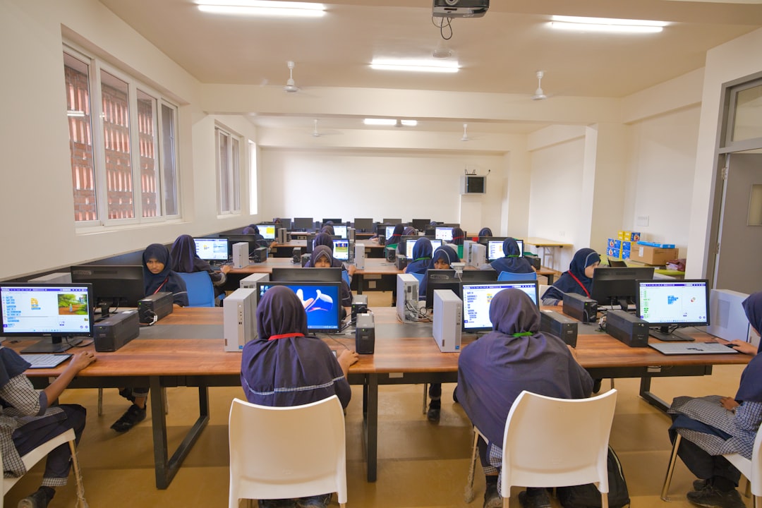
Image not found in postmetaThis alignment reinforces coherence between message and experience. When visual identity contradicts stated values, students perceive inconsistency. For example:
- An institution promoting creativity but using rigid, uninspired templates weakens its message.
- A program emphasizing accessibility but employing low-contrast visuals creates dissonance.
Developing a comprehensive brand style guide for online education environments ensures that course designers, instructors, and administrators maintain visual alignment. This guide should include detailed specifications for:
- Primary and secondary color schemes.
- Typography hierarchies.
- Imagery style and tone.
- Iconography and graphic treatments.
When all contributors follow shared standards, the learner experience becomes seamless.
The Role of Micro-Interactions and Interface Details
Beyond macro-level branding, small design details—often referred to as micro-interactions—play a vital role in connection. The animation of a progress bar, the visual feedback after submitting an assignment, or a subtle highlight indicating completion can foster motivation.
These cues provide reassurance. They affirm that the system is responsive and attentive. In face-to-face learning, verbal affirmation or nods serve this function. Online, visual cues assume that role.
Effective micro-interactions should be:
- Subtle rather than distracting.
- Consistent in style and timing.
- Meaningful and directly related to learner tasks.
A blinking notification without clear purpose can cause anxiety. In contrast, a clearly designed progress tracker communicates transparency and encourages persistence.
Fostering Community Through Shared Visual Language
Connection in online education extends beyond individual courses. It encompasses the broader learning community. A unified visual identity strengthens the sense of belonging across programs and student groups.
Shared visual elements—such as digital badges, certificates, community spaces, and branded virtual events—create common reference points. These elements signal that students are part of something larger than a single class.
Consider the impact of:
- Cohesively designed discussion forums that visually signal collaboration.
- Branded templates for student projects displayed in online showcases.
- Consistent event visuals for webinars and academic gatherings.
When learners recognize visual markers across different contexts, they internalize their membership in a structured academic community. This sense of continuity can reduce feelings of isolation and improve retention.
Implementing Thoughtful Visual Identity Strategically
Developing a meaningful visual identity for online education requires strategic planning rather than ad hoc design decisions. Institutions should approach this process methodically:
- Assess learner needs and expectations. Conduct surveys and usability testing to understand pain points.
- Audit existing visual materials. Identify inconsistencies and inefficiencies.
- Develop a unified visual framework. Create clear documentation and accessible templates.
- Train faculty and staff. Ensure consistent implementation across departments.
- Continuously evaluate and improve. Update visual systems in response to feedback and technological advancements.
This structured approach balances creativity with accountability. It ensures that visual identity remains purposeful rather than ornamental.
Conclusion
Online education thrives not only on technological infrastructure and academic rigor but also on the quality of the learner experience. In digital environments, where physical presence is absent, visual identity becomes a primary means of communication. Through consistency, accessibility, authenticity, and strategic alignment with institutional values, thoughtful visual design builds trust and fosters meaningful connection.
Institutions that invest in this dimension of their educational strategy demonstrate seriousness of purpose. They acknowledge that learning is both cognitive and emotional. By shaping digital spaces that are coherent, human-centered, and inclusive, educators create environments where students feel seen, supported, and motivated to succeed.
In the evolving landscape of online education, visual identity is not merely decoration. It is infrastructure for connection.