
Custom embroidery turns a simple logo into a tactile brand asset with texture, depth, and long-lasting appeal. Whether a company is creating uniforms, caps, patches, tote bags, or merchandise, a well-planned embroidered logo can communicate professionalism while adding a handcrafted quality that printed graphics often cannot match.
TLDR: Sewn logos work best when designs are simplified, bold, and optimized for thread. Successful custom embroidery logo design depends on clean shapes, limited colors, smart stitch choices, and the right fabric. By balancing brand identity with technical embroidery requirements, businesses can create logos that look polished on apparel and promotional products.
Why Embroidered Logos Remain Popular
Embroidery has remained a favorite branding method because it feels premium, durable, and professional. Unlike ink-based printing, thread sits on top of the fabric, creating dimension and a sense of craftsmanship. This makes embroidered logos especially effective for workwear, hospitality uniforms, sports apparel, school merchandise, and corporate gifts.
A sewn logo also gives a brand a more permanent presence. Threads are resistant to washing, fading, and everyday wear when applied correctly. For companies that want their identity to appear on garments that are used repeatedly, embroidery offers both visual impact and longevity.
Key Principles of Custom Embroidery Logo Design
Not every digital logo translates perfectly into stitching. A logo that looks sharp on a screen may become crowded or unreadable when reduced to thread. Because embroidery has physical limits, designers usually adapt logos before production.
The most successful embroidered logos often follow these principles:
- Simplicity: Clean, uncomplicated shapes stitch more clearly than intricate details.
- Strong contrast: Thread colors should stand out against the fabric background.
- Readable lettering: Text should be large enough for the stitches to form clean edges.
- Limited color palettes: Fewer thread colors usually create a cleaner and more affordable result.
- Scalable design: The logo should remain recognizable on both small caps and larger jackets.
Designers commonly simplify tiny lines, remove gradients, reduce shadows, and convert complex illustrations into bolder shapes. The goal is not to weaken the brand identity, but to translate it into a form that thread can reproduce beautifully.
Logo Ideas That Work Well for Embroidery
Several types of logo styles are especially suitable for sewing. A company that is developing a new identity or adapting an existing one can consider these approaches.
1. Monogram Logos
Monograms are ideal for embroidery because they rely on letters, initials, and compact compositions. A restaurant, salon, boutique, or consulting firm may use a monogram on shirts, aprons, towels, or caps. When designed with bold letterforms and balanced spacing, a monogram can look elegant and timeless.
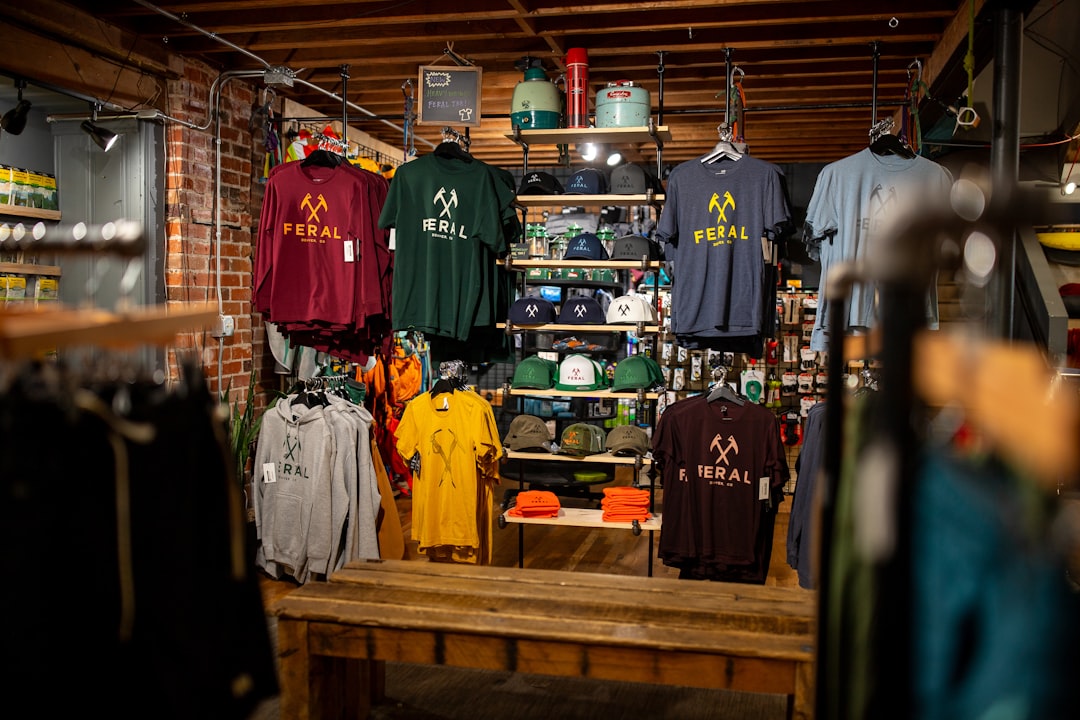
2. Badge and Emblem Logos
Badge-style logos are popular for breweries, outdoor brands, sports teams, schools, and local businesses. Their enclosed shapes create a natural patch-like appearance. However, designers must avoid overcrowding the badge with tiny slogans, dates, stars, or decorative lines. A simplified emblem usually stitches better than a detailed seal.
3. Wordmark Logos
A wordmark uses the brand name as the main design element. This can work well if the typeface is clean, thick enough, and not overly decorative. Script fonts can be beautiful in embroidery, but they require careful digitizing so thin strokes do not break apart.
4. Minimal Icon Logos
Simple icons are excellent for small embroidered placements such as hat fronts, shirt pockets, and sleeve logos. A coffee cup, mountain, leaf, paw, house, or tool can become highly recognizable when reduced to strong lines and shapes.
Choosing the Right Stitch Types
Embroidery is not only about the artwork; it is also about how the artwork is stitched. Different stitch types create different effects, and skilled digitizers use them strategically.
- Satin stitch: Often used for lettering, borders, and narrow shapes. It creates a smooth, raised finish.
- Fill stitch: Used for larger areas that need solid coverage. It can be adjusted for texture and direction.
- Running stitch: Used for fine outlines, detail work, and delicate accents.
- Bean stitch: A reinforced running stitch that creates a bolder line with a hand-sewn look.
- 3D puff embroidery: Uses foam beneath the thread to create raised logos, often seen on caps.
The stitch direction also affects the appearance of the logo. By changing angles, a digitizer can create subtle highlights, textures, and visual movement. For example, a leaf icon may appear more natural when stitch directions follow the shape of the veins.
Understanding Digitizing
Digitizing is the process of converting a logo into a stitch file that an embroidery machine can read. It is more than a basic file conversion. A digitizer decides the stitch type, stitch direction, density, pull compensation, underlay, color sequence, and trims.
Good digitizing can make a simple logo look refined, while poor digitizing can cause puckering, gaps, uneven edges, and thread breaks. This is why a high-quality embroidered logo usually begins with a properly prepared file. Common embroidery file formats include DST, PES, EXP, JEF, and VP3, depending on the machine being used.
Pull compensation is particularly important. As stitches enter the fabric, they can pull the material inward and distort the design. Digitizers adjust the artwork slightly so the final sewn result appears accurate after stitching.
Color Selection for Sewn Logos
Thread color plays a major role in logo quality. Although thread charts offer many shades, they may not perfectly match digital colors or printed brand guidelines. A company that values strict brand consistency may need to compare physical thread samples before production.
For best results, designers often use:
- High contrast combinations for readability, such as white thread on navy fabric.
- Slightly simplified palettes to reduce thread changes and improve clarity.
- Metallic or specialty threads for premium accents, used sparingly.
- Tonal embroidery for a subtle, stylish look, such as black thread on charcoal fabric.
Gradient effects are difficult to reproduce in embroidery. Instead of smooth digital fades, designers may use layered colors, directional stitching, or simplified shading. The final result should look intentional rather than like a compromised version of the original logo.
Fabric and Placement Considerations
The same logo can stitch differently depending on the fabric. Heavy cotton, denim, fleece, canvas, polyester, mesh, and performance fabrics all behave differently under the needle. Stable fabrics generally support embroidery more easily, while stretchy fabrics require special stabilization.
Popular logo placements include:
- Left chest: A classic choice for uniforms, polos, and button-up shirts.
- Hat front: Highly visible and ideal for compact logos or icons.
- Sleeve: Good for secondary marks, flags, or small brand symbols.
- Back yoke: A subtle location for apparel branding.
- Bag panels: Effective for promotional products and retail merchandise.
Size matters. Small embroidery may not support tiny text or complex details, while oversized embroidery can feel stiff due to high stitch density. A balanced design considers both appearance and comfort.
Techniques for Making Embroidery Look Professional
Professional embroidered logos are the result of careful design, testing, and production control. Several techniques can improve the final outcome.
- Use proper underlay: Underlay stitches stabilize the fabric and support top stitches.
- Avoid excessive stitch density: Too many stitches can cause stiffness, puckering, and thread buildup.
- Test sew before bulk production: A sample reveals issues that may not appear on screen.
- Adjust for garment type: Caps, polos, jackets, and bags may each require different digitizing settings.
- Keep small text simple: Block fonts usually perform better than thin serif or script fonts at small sizes.
Businesses that plan to embroider the same logo across several product types may benefit from multiple embroidery versions. A full logo may work on jackets, while a simplified icon may be better for caps or sleeves.
Common Mistakes to Avoid
Many embroidery problems begin with artwork that was never designed for thread. Thin lines, microscopic text, photographic effects, excessive color changes, and complex textures can all reduce quality. Another common mistake is expecting one logo file to work perfectly at every size.
It is also important to avoid choosing fabric and thread colors without considering contrast. A beautiful dark green logo may disappear on a black polo. Likewise, a very detailed multicolor logo may look impressive on a large back panel but unreadable on a small chest placement.
Finally, skipping the sample stage can be costly. A test sew allows the designer or production team to evaluate thread tension, fabric reaction, color accuracy, and readability before completing a full order.
Building a Brand System for Embroidery
A strong embroidery strategy often includes more than one logo version. A brand may maintain a primary embroidered logo, a simplified mark, a one-color version, and a small-size version. This system allows the identity to remain consistent across different garments and accessories.
For example, a landscaping company might use a full badge logo on jacket backs, a leaf icon on caps, and a simple wordmark on polo shirts. Each variation supports the same brand while respecting the limits of the product and placement.
When embroidery is treated as part of the brand system rather than an afterthought, the result looks more intentional and professional.
Conclusion
Sew logos combine visual branding with craftsmanship. The best custom embroidery logo designs are clear, scalable, and thoughtfully adapted for thread, fabric, and placement. By focusing on simplified artwork, smart stitch choices, suitable colors, and careful digitizing, businesses can create embroidered logos that are durable, attractive, and memorable.
Whether used on uniforms, hats, patches, or merchandise, embroidery can strengthen a brand’s presence in a practical and stylish way. A well-sewn logo does more than decorate fabric; it gives the brand a physical identity that people can wear, use, and recognize.
FAQ
What makes a logo suitable for embroidery?
A suitable embroidery logo has clean shapes, readable text, strong contrast, and limited fine detail. Bold designs usually stitch better than complex illustrations or logos with gradients.
Can any logo be embroidered?
Most logos can be adapted for embroidery, but some require simplification. Tiny text, thin lines, shadows, and photographic details may need to be removed or redesigned.
What is embroidery digitizing?
Embroidery digitizing is the process of converting artwork into a stitch file for an embroidery machine. It controls stitch type, direction, density, sequence, and other technical details.
What is the best size for an embroidered logo?
The best size depends on placement. Left chest logos are commonly around 3 to 4 inches wide, while cap logos are often smaller. Large back designs can be much bigger, but they should remain comfortable and not overly dense.
How many colors should an embroidered logo use?
Many embroidered logos work best with one to five colors. Fewer colors can improve clarity, lower production complexity, and create a cleaner finished look.
Why does small text sometimes look unclear in embroidery?
Small text may lose clarity because stitches have thickness and fabric can shift during sewing. Larger letters, simpler fonts, and proper digitizing help improve readability.
Is 3D puff embroidery good for all logos?
3D puff embroidery works best for bold letters and simple shapes, especially on caps. It is not ideal for tiny details, thin outlines, or very complex logos.