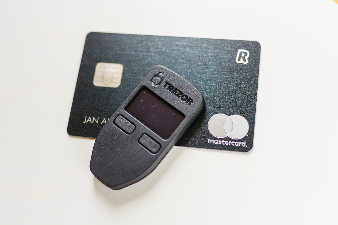
Imagine a world where you don’t need to remember a single password. Sounds dreamy, right? Well, that’s what passkeys offer. They’re the cool new kids on the authentication block. But here’s the catch: not everyone knows what a passkey is or how it works. So, creating a great User Experience (UX) for passkey-only products means we need to do some serious educating — and we need to do it well.
What Are Passkeys, Anyway?
Before we dive into UX talk, let’s level up on what passkeys are. Think of passkeys as your digital fingerprint or face. Instead of using a password to log in, you use your device’s biometric options — like Face ID or fingerprint — or a device PIN.
When you use a passkey:
- You don’t need to remember anything.
- You don’t type passwords or OTPs.
- Your login is more secure. No phishing!
It’s faster, smarter, and safer. But — and here’s the big BUT — users need to know that, or else they might panic when there’s no password field in sight.
Designing UX Around Education
Education is a key part of user experience. If we want users to adopt passkeys without losing them halfway through the journey, we’ve got to teach them, gently.
Start With a Friendly Intro
The first interaction sets the tone. When a user visits your app or website for the first time, greet them with a short explainer.
Something like:
Welcome! We use passkeys for logging in – it’s passwordless, faster, and way more secure.
This breaks the ice. It sets expectations and reduces surprise. A video demo or animation here could work wonders.

Use Plain Language
Tech terms? Leave them at home. People don’t want to hear about “public key cryptography” or “FIDO2.” They just want to know:
- What is happening
- Why it’s good for them
- What they need to do next
Think like a teacher in a room full of kids: clear, easy, and fun.
Step-by-Step Guidance
Don’t assume they’ll figure it out. If you’re asking them to “create a passkey,” include steps:
- Tap create passkey.
- Use your face or fingerprint to confirm.
- You’re in!
Each action should be bite-sized. Bonus points if they can’t mess it up.
Visual Cues Help
Icons, animations, progress bars — use them! They give reassurance and a sense of movement. A spinning face scanner or a fingerprint pulse animation tells the user, “Hey, something is happening. You’re doing it right!”

People are visual learners, and reassuring visuals can lower anxiety, especially for a new and unfamiliar method like passkeys.
Rescue Plans Are Vital
Here’s a truth bomb: sometimes things go wrong. Maybe a user gets a new phone. Maybe they switched browsers. Maybe they just have no idea what a passkey is.
Your UX should tell them what to do next. Have a “Need help?” link with super clear options:
- Set up again on your new device
- Use another device
- Contact support
Don’t just say, “Passkey not found.” Say what happened and how to fix it. It’s like giving directions and a flashlight.
Celebrate Small Wins
Once the user successfully sets up or logs in with a passkey, throw a tiny party.
🎉 You did it! You’re now logged in without a password.
Positive reinforcement builds confidence. Confidence means the next time, they won’t hesitate. And the next-next time? They’ll tell their friends.
Build Trust Early
Trust is your secret UX sauce. Passkeys may be unfamiliar, but people trust Apple Face ID or Google’s fingerprint sensor. So, lean into what they already trust.
Say things like:
“This uses your device security features – just like unlocking your phone.”
That shows you’re using the same safe tech they already use daily.
Let Them Know They’re Not Alone
A little human touch helps. Show messages like:
85% of our users love logging in with passkeys. You’re joining a smarter crowd!
This reduces hesitation. Social proof is powerful, even in UX.
Don’t Make It Optional (Kinda)
If you’re building a passkey-only product, be clear from the start. But ensure users don’t feel cornered.
Explain why it’s better:
- No passwords = no data leaks
<liBiometrics = no guessing
<liFaster = fewer login headaches
Then guide them through why you’ve made the switch. Users love to feel like they’re part of the future.
Test With Real People
You might think your tool is simple. But until grandma tries it, you’ll never know.
Run usability tests with:
- Young people ✅
- Older users ✅
- Non-techies ✅
Watch where they get confused. Then design around that.
Keep Education Going
Your onboarding is just the start. Keep those helpful nudges coming. For example:
- “Did you know your passkey also works on your tablet?”
- “Moving to a new phone? Here’s how to move your passkey.”
Think of it as on-the-job training for users. They’ll get better with time and guidance.

Final Thoughts
Passkeys are awesome. But they’re new. So, users need help. Not with techy tutorials, but with smart, human-centered UX.
Your mission: make users feel like passwordless is not only safe — it’s better. Do this with smart guidance, kind words, and helpful visuals.
Because when the experience is simple, users won’t just “get it.” They’ll love it. And they’ll keep coming back. No passwords required.

